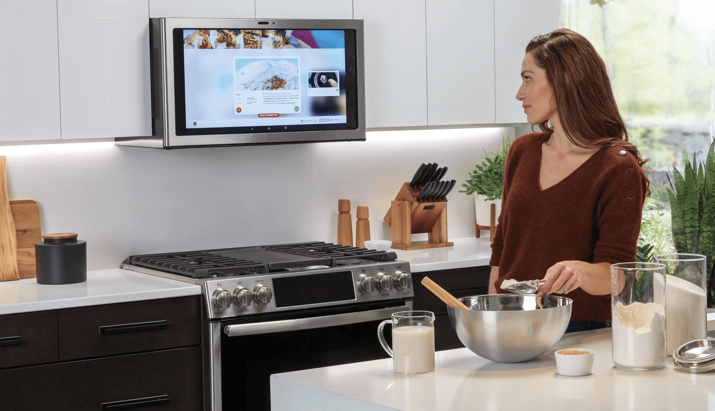
Designing the first MVP experience for GE Appliances’ SmartHQ Assistant on a built-in LCD appliance screen.
MY ROLE
team
tools
my impact
company

key insight
Project scope
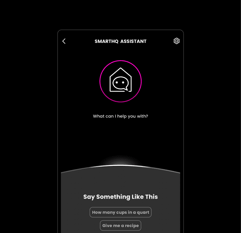
Same Assistant with More Opportunities
Project scope
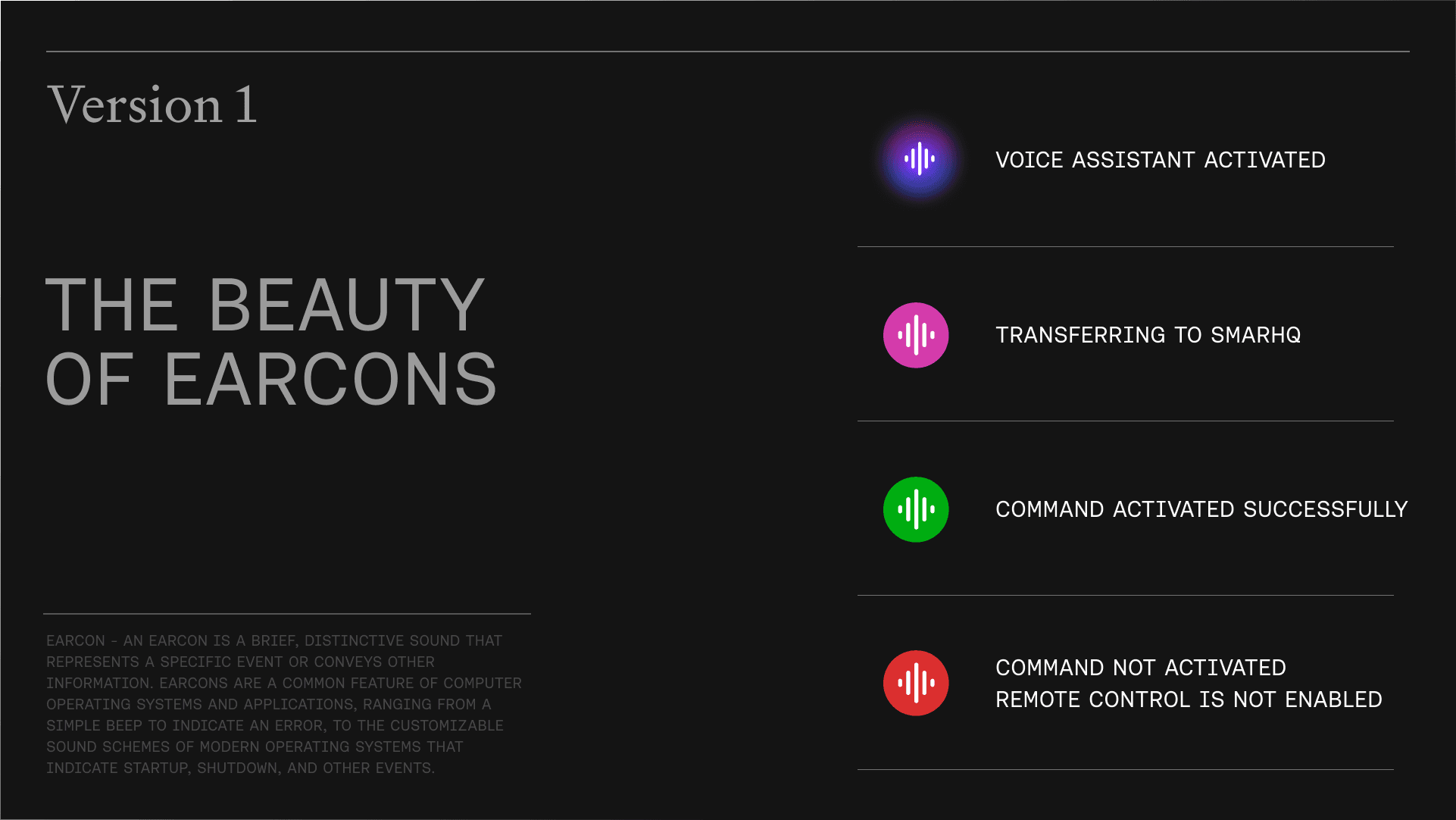
Audio feedbacks? Voice feedbacks? Or chat bubbles?
Just like any human-to-human communication,
to be effective is to be clear with the right amount of information,
be open-ended or guided when needed.
Clear communication about its capabilities.
While also help users learn more about them at the same time (MVP).
Lack of resources to acquire conversational API.
Is there a solution?
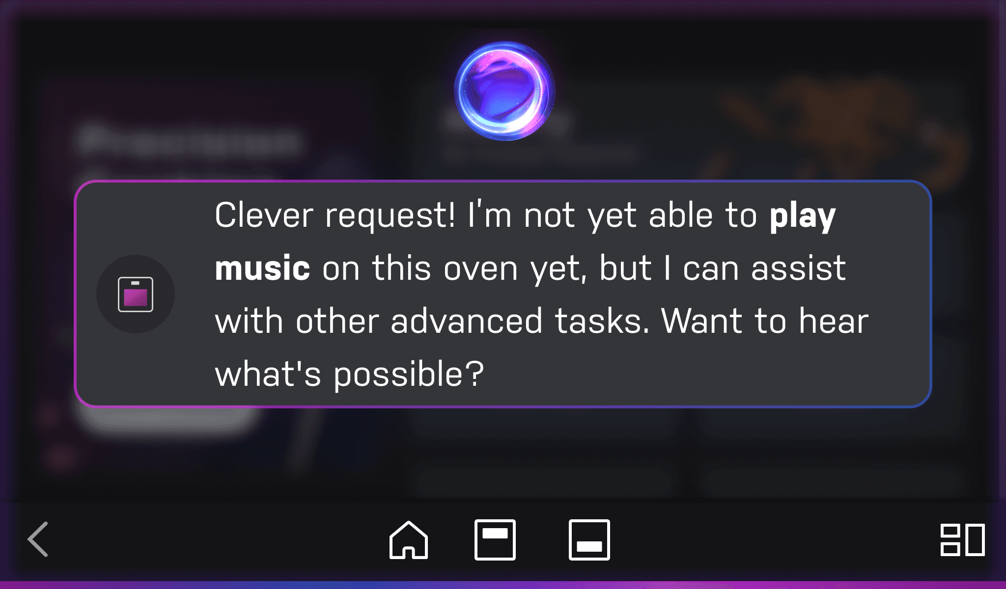
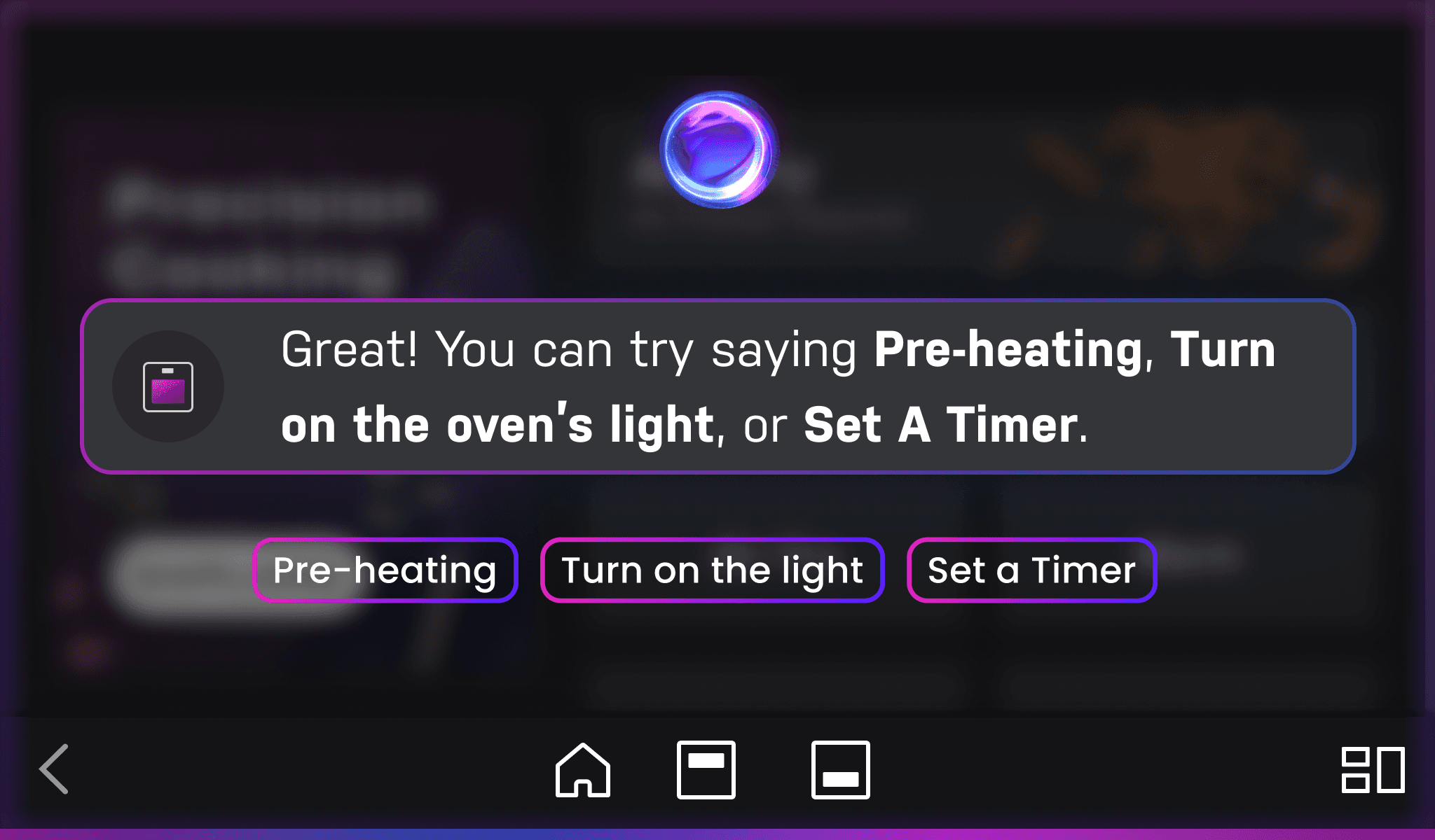
What if people ask queries, not command?
key challenges
Redefining Interaction
for a New Context
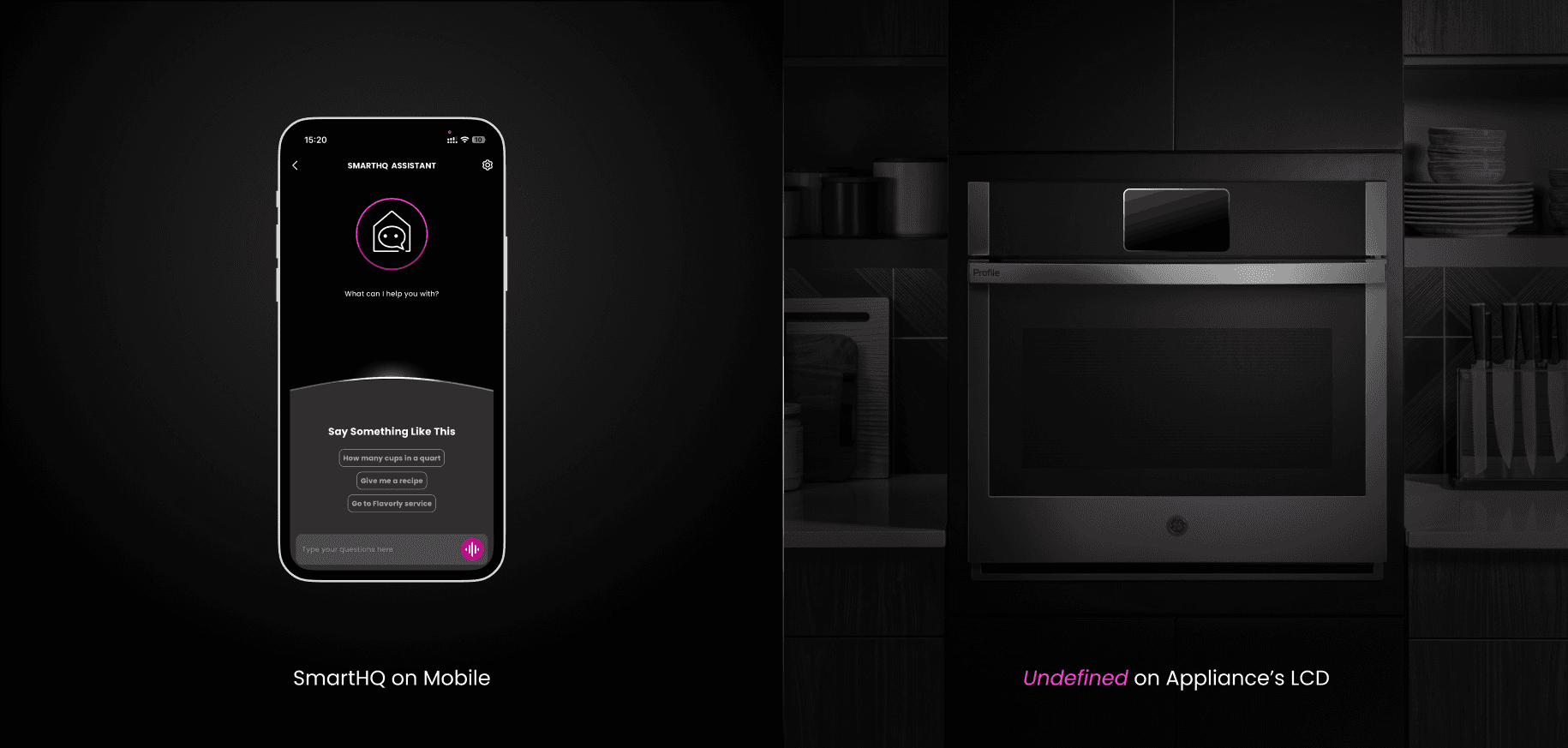
SmartHQ Assistant existed solely on mobile. There was no precedent or pattern library for delivering a voice-forward experience on an appliance screen.
Hence for sprint, I need to deliver: a cohesive design system that convey the assistant intelligence, provides contextual awareness, and clear affordances regarding its states.
No prior voice-assistant visuals, UI architecture, and interaction model on appliance screens.
Engineering needed a better design-to-dev handoff assets and design guideline.
solution statement
mobile analysis
To inform the LCD design direction, I conducted an audit of the existing SmartHQ Assistant mobile experience and uncovered key friction points in interaction flow, visual design, and accessibility.
6 Steps = 0 Patience
The interaction requires up to six separate steps for users to receive a response, introducing delays that may disrupt kitchen tasks.
Constant transitions
= Overwhelming users
Frequent major UI changes for each request can contribute to cognitive overload, especially during time-sensitive moments like cooking.
Vibrant? Yes.
Readable? Not for long…
The chat bubble's design lacks accessibility compliance, with a high saturated magenta that can strain readability—particularly for users reading longer responses and time.
solution
From 6 Screens To 1 Unified Interface
interaction mechanism
Visualizing Interaction for Engineering
To support implementation, I created simple wireframe animations to illustrate key interaction flows. These visuals helped engineers clearly understand how the dialog frame responds to user input and transitions across states.
SUPPORTING SWE
Z-Stack Spatial Design Visualization
To support development, I decomposed the UI into clear visual layers—system operations in the foreground, followed by assistant status, chat bubbles, and background elements. This structure aligned with engineering logic, enabling faster understanding and smoother implementation from dev team.


design iterations
Being Agile and Iterate
After presenting my first iteration, team feedback revealed that the design strayed from our core goals—particularly in aligning with SmartHQ’s established branding and interaction patterns. This help me re-focused to the need to stay grounded in scope while also thinking for innovation.
The 2nd iteration focused on aligning with SmartHQ’s global branding, incorporating modern refinements like light frosted chat bubbles and thin borders. While the visuals improved, there remained opportunities to simplify the interaction flow and reduce complexity.
learning